How to Choose Beautiful Photos for Your Website?
I recently saw an ad on TV that showed some brilliant food photos – flaming hot chillies, melting ice cream, a sizzling barbeque, iced tea, hot coffee, and more. Turns out it’s for a toothpaste that treats tooth sensitivity. I have zero tooth sensitivity and no intention of switching from my current toothpaste but every time that commercial is on, my eyes are glued to the screen.
If you are wondering what this has to do with your website photos, I wanted to share a first-hand experience of how compelling photos have the power to pull users in and help your brand.
Here is the ad if you are curious.
If you have a website or are planning to build a website, curating photos is the fun part. Here are some recommendations on what to look for in these photos. Tips that can help you elevate your brand and website both.
(You can also use these when selecting photos for your social media posts, emails or online advertising)
This is not a tip but a golden rule: Use original product or customer photos, wherever possible. These add a touch of authenticity and show readers your products, people, customers, and results achieved by using your products/services. This can be challenging so don’t be disheartened if this isn’t feasible or right for your business.
The criteria below apply to both original as well as stock photographs.
Set Some Ground Rules
Will your website photos always include people, people using your products/services, or will they focus on the product you are offering – zoomed in, high-quality product photographs like the toothpaste commercial above. Do you want the setting to be professional or is a more relaxed casual approach better suited to your website?
Spend some time thinking about these things, set some ground rules before diving into a pile of photographs.
Good Lighting
Whether you are using original or stock photos, lighting can make all the difference. Good lighting ensures all the important subjects in the photo are clearly visible and well lit. It can even guide the viewer’s eye to what you’d like them to see (the model, the product, or something else).
Here are examples of some well-lit photos. Though the 2nd one is set up in a darker environment you can see that the guy’s face is well lit. It still looks intentional and professional.


If you want to take it a step further, pick images with soft shadows instead of stark ones (stark/hard shadows usually have a clear dark outline, you see these when you step out in the afternoon between 12 to 4pm) Soft shadows are almost invisible and make images look more natural whereas stark shadows give a more dramatic look. Most websites lean into a more natural look, thus the recommendation.
Stark shadows can be used to create a specific look and appeal, slightly hard to curate but go for it if that’s right for your brand! You can read more about this and see examples here and here
Ample Negative Space (aka Blank Space)
If you are going to remember one thing from this article, let this be the one! Don’t crowd the photograph with too many things or people. Give everything ample empty space to breathe.
Having limited elements ensures that the viewer is not confused or overwhelmed by everything going on in the photograph. A good photo automatically draws the viewer’s eye to the most important person or object. Something that the curator or the photographer wants them to look at.
An image can have multiple people or objects and still meet this criterion. Here are some examples of photos with and without sufficient negative space.


Use People in Your Photographs
You’ve probably heard this one before but it’s worth repeating. Having images with people in them is important and has shown to impact conversions. There have been several studies that show that site visitors respond favourably to photos with people than those without them.
Let’s take this a step further – keep a few things in mind when choosing people/models for your photographs:
- Choose someone that represents or looks like your potential or existing customer base – gender, age, setting i.e. professional or casual. You want the viewer to imagine themselves in that setup or using your products and services.
- Be inclusive – Avoid stereotypes and embrace diversity. It’s about time all of us are conscious of what we put out there, how we represent our brand, community. Let it be an invitation to everyone.
Special shout out to Unsplash for this, it has the most diverse collection of photos I’ve ever come across.
Be inclusive: Avoid stereotypes and embrace diversity.
It’s about time all of us are conscious of what we put out there, how we represent our brand, community. Let it be an invitation to everyone.
Use Them in the Right Context
If you are using an image for the About Us page, it may make sense to have a group of people (most likely your team) on it. If it’s a product page, a close-up of your product or a photo of someone interacting with your product or service would make sense. You want the photo to help convey the core goal or message of the page, especially given our limited attention spans.
When looking at stock photos, go beyond the first few pages and be patient. When you see the perfect image, you’ll know it.
Add Your Unique Touch
Using stock photos doesn’t mean your site has to look like everybody else’s. Add your personal stamp to make them your own.
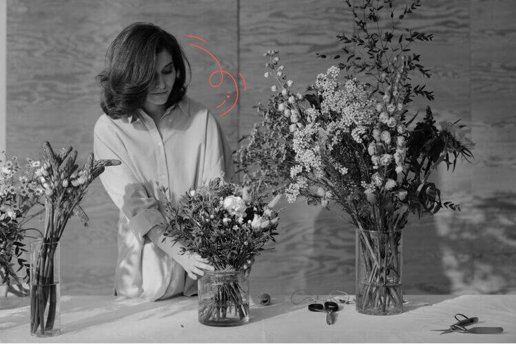
We sometimes use stock photos on the OnlyDomains blog, but all of them have the ‘OnlyDomain’s touch’ – a black and white filter + illustrated elements. These hand-drawn elements are a part of our primary website and help with brand continuity.
You can find a unique way to personalise your photographs.


Where Can You Find Good Stock Photos?
Here are some of our favourite stock photo websites; all the images used in this post are from the below list of websites.
Unsplash – free
Pexels – free
Pixabay – free
Adobe Stock – paid
Shutterstock – paid
Here’s a massive list of free stock photo websites.
Lastly, don’t stress too much when choosing website photos, these aren’t permanent. You can start with something that feels right and replace it if you find something better in the future.
Disclaimer: All the photos above are used for demonstration purposes only. Please download them from the original website if reusing them.
You May Also Like